Supply and Demand Zones: Identifying Key Market Levels
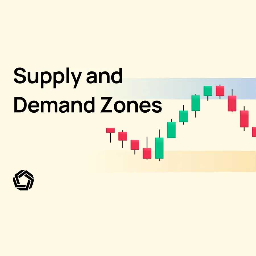
Have you ever noticed how significant market moves often start from the same price levels? This is because large institutions place their buy and sell orders at these key points. By identifying supply and demand zones, you can gain insight into where these big moves are likely to happen. In this article, we’ll guide you through how to find supply and demand zones and show you everything you need to know to start incorporating them into your trading strategy with confidence.
- Why Supply and Demand Zones are Important (With Historical Charts)
- How to Identify Supply and Demand Zones (With Live Examples)
- Supply and Demand Zones VS Support and Resistance
- How to Use Supply and Demand Zones in Your Trading Strategy (A Checklist)
Why Supply and Demand Zones are Important
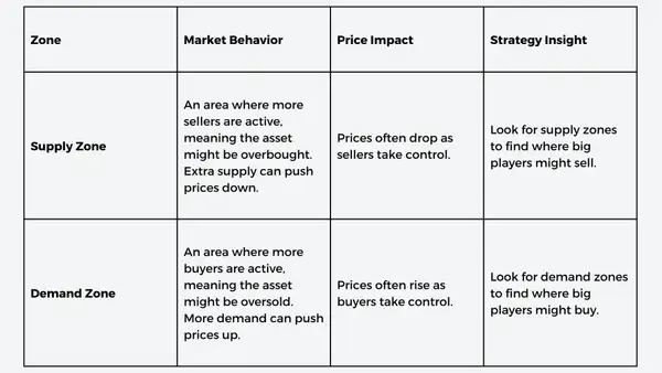
These zones are grounded in the fundamental laws of supply and demand. When prices reach a supply zone, an area where sellers have previously dominated, the asset is often considered overbought. Here, an excess of supply could lead to a decrease in price as sellers start to outweigh buyers. Conversely, a demand zone is an area where buyers have historically had control, indicating the asset is potentially oversold and prices may go up due to increased buying. Thus, if you are able to identify such supply and demand zones, you are in a way able to follow the smart money, as you know they will probably buy or sell at these levels.
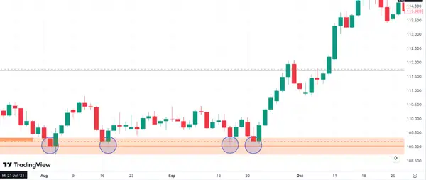
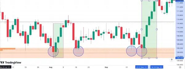
Here is an example of a demand zone at around 109 for the USD/JPY pair. You can clearly see how there are buy orders once the candles fall into the orange zone. It shows as a horizontal range where the price has previously stabilized or reversed to the upside. On the chart, this is represented by a cluster of bullish candles with the first move and then several more times when the candles bounce of the demand area. Hence, when price action enters this zone, it often experiences upward pressure due to accumulated buy orders at those levels.
What is important to note is that the demand zone starts with a strong upward move. This gives an indication that big institutions are buying in this area.
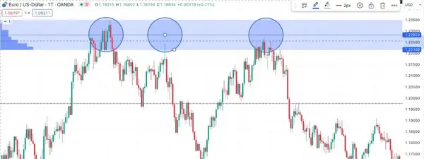
Similar to the chart below, where the first move downwards in the supply zone starts with three big red candles, indicating that there was immense selling pressure by an institution at around 1.22 on the EUR/USD chart. On a chart, you'll often see this as a level where the price went up a few times but then turned back down. It's like hitting a wall. When the price gets close to this zone, it usually starts to drop again because so many people are selling. This zone can be a good spot to consider taking profits or shorting the market, expecting the price to decrease.
Supply and demand zones are particularly effective when applied to forex markets. The forex market dwarfs its counterparts, like the cryptocurrency market regarding daily trading volume. According to the research of the BIS, the forex market had a daily trading volume exceeding $7.5 trillion, compared to the cryptocurrency market, which, according to metrics of Coinmarketcap is estimated to have a daily volume of around $30 billion to $50 billion. This enormous scale means that significant price movements in the forex market—often represented by large candles on price charts—are typically driven by institutional players. These institutions have the financial muscle to buy and sell enormous amounts of foreign currencies, thereby creating supply and demand zones that can influence the market far more than individual retail traders. Therefore, understanding these zones becomes especially vital for traders who want to trade the forex market effectively.
How to Identify Supply and Demand Zones
When identifying supply and demand zones, you should first be aware of the narrative. Remember, especially in the FOREX market, you are always looking for supply and demand zones to be initiated by rather big moves, indicating an institution might be buying in this area. If this area gets re-tested again, then you might have actually found a zone and can investigate further.
Finding Supply and Demand Zones and Drawing on a Chart
Drawing these zones begins with finding areas where price has changed direction in the past. For a demand zone, look for a region where the price has previously dropped to a certain level and then rebounded upwards. Conversely, a supply zone is an area where the price has risen to a point and then turned downwards. Do not worry, if you’ll have some open questions throughout, we will cover the specifics later on. To draw the zones, mark horizontal lines at the highest and lowest points of these turning areas. Our personal tip is first to get a glimpse of trading view and apply the automated filter. As shown in the image below;
(1) go to your chart, (2) click on indicators in the bar at the top, and (3) search for a Supply and Demand Script.
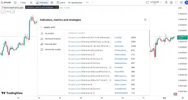
Once you find a promising script, (4) go to your trading platform and start doing some further analysis.
Technical Analysis Tools
The first step in identifying these zones involves using technical analysis tools. Traders commonly use indicators like moving averages, volume profiles, and price action patterns to help pinpoint these zones. For instance, a high volume area on a volume profile may indicate a demand zone, as it shows a level where many buyers have previously entered the market.
We think that a good starter combination to actually gauge supply and demand zones might be using the Chaikin Money Flow (CMF) and the Awesome Oscillator (AO) together. Both can give us a well-rounded strategy for identifying and validating the potency of a supply zone.
The Chaikin Money Flow (CMF) is a technical indicator that combines price and volume data to assess a market's buying and selling pressure over a specified period. The Awesome Oscillator (AO) is a momentum indicator that calculates the difference between a 34-period and a 5-period simple moving average, designed to capture market momentum and possible trend changes.
If our asset has re-entered a known supply zone and the AO and CMF are signalling bearish trends, this could indicate a likely downward move in price. Here's how we can understand these indicators and plan our strategy:
Confirming Supply Zone Strength: As the price moves back into the supply zone, the AO turning red and moving downward could be our first clue that the zone will likely act as resistance, possibly driving the asset's price down.
Chaikin Money Flow Decline: A decreasing CMF from a level of 0.4 implies a reduction in buying pressure and an increase in selling pressure. This additional signal corroborates the AO's bearish outlook, suggesting that the supply zone might indeed hold strong.
Strategy and Entry Points: Considering these indicators, we might think about entering a short position, betting that the price will decline from the supply zone. The optimal entry point could be as soon as both indicators confirm a bearish trend. Setting a stop-loss just above the supply zone can offer risk management.
Want to make better-informed decisions? Combine traditional technical analysis tools with Morpher AI, a cutting-edge tool designed to help with your analysis and enhance your swing trading strategy. Morpher AI uses advanced algorithms to analyze real-time market data, helping you quickly identify trends, and key price levels. It simplifies the trading process by providing actionable insights, reducing the time spent manually scanning charts, and allowing you to make more precise trades. Future of trading is here!
What to Watch For:
AO Continuation: We should keep a close eye on the AO. If it continues to decline or stays below the zero line, that would reinforce our bearish expectations.
CMF Levels: Monitoring the CMF is crucial. If it keeps going down or crosses below zero, this would provide more evidence of increasing selling pressure.
Volume: Although the CMF accounts for volume to some extent, we should still monitor raw volume data for any abrupt changes, as this can influence both indicators.
Risk Management: It's imperative to set appropriate stop-loss and take-profit levels. Given that we're contemplating a short position, a stop-loss slightly above the supply zone can safeguard us from potential false breakouts.
Additional Confirmation: We might also look for other bearish technical patterns, such as bearish engulfing candles or trendline breaks, for extra assurance.
Live-Scenario Example on the Charts
We have already shown you real examples of supply and demand zones in the introductory part, but how would you spot one? This is what we will do in this scenario, where we will show you how we would approach taking a trade in a supply and demand zone. In this case, we will be analyzing a supply zone on the USD/JPY chart, you can see the full chart below.
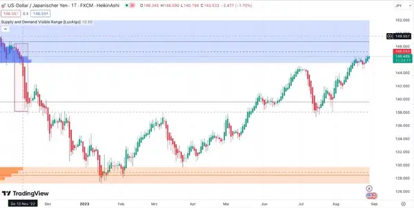
Let’s start by breaking down our analysis into parts. First, we need to see if a big move downwards happened to confirm institutional involvement. As you can see from the chart, there has actually been a huge red candle from the price of 146 to 138. This shows that this selling pressure could only come from an institution. You can see it at the chart's start, outlined by the big red box. So, we have the first crucial confirmation.
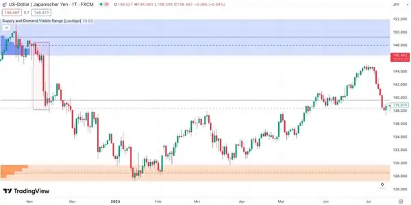
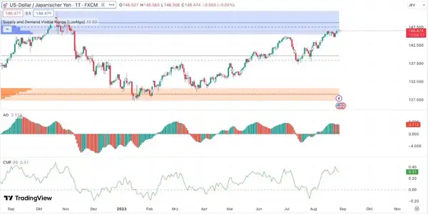
Then we approach the “live part” on the charts, the part where the candles stop. We see that the price is once again, moving into the supply zone. In the chart below, you can clearly see how the candles are coming into the blue zone on the top again. The move alone into the supply zone does not confirm anything yet. Hence, we approach the next part and apply both our indicators, the Awesome Oscillator and the Chaikin Money Flow Indicator. You can see both indicators in the chart below.
First, we look at the Awesome Oscillator (AO). If the AO turns red and moves downward, it could be our first clue that the zone is likely to act as resistance, possibly driving the asset's price down. As you can see, the AO indicator has indeed just started turning red and moving downward again.
Secondly, we look for a confirmation from the Chaikin Money Flow (CMF), which shows a decline from a high level of 0.4. This additional signal corroborates the AO's bearish outlook, suggesting that the supply zone might hold strong.
Now that we got all of the technicals out of the way, we have to make a decision. Here is what we have so far:
(1) A big institutional move out of a potential supply zone
(2) The price is moving back into the supply zone
(3) The AO indicator suggests that the price might move down again
(4) CMF also confirms a bearish outlook
So now to our conclusion and the move we might take from this information. The first hunch is to wait a bit for a bigger red candle for confirmation, as the potential declining trend is just forming. In this case, the probability of taking a short is high, as all the indicators confirm our hypothesis. Nevertheless, we might look at the chart Heikin-Ashi Candles (a special kind of candle view for trends). This would give us the final confirmation of where the trend is going.

In this case, we still have green candles, so we are not taking the trade just yet. However, the candles are getting smaller, with small upper shadows, which is an indication that the trend might flip soon. Once the Heikin Ashi Candles will turn red, we will once again confirm with the AO and CMF indicator and open our short position. To protect our short we will put a stop-loss at the top of the supply zone, around 152.
Tips and Best Practices
- Timeframe Matters: The reliability of the zones often increases with higher timeframes like the daily or weekly charts.
- Volume Confirmation: Always look for volume confirmation. A high trading volume in a particular zone increases its significance.
- Fresh Zones: Zones are considered ‘fresh' if they have not been revisited by the price action after their formation. These fresh zones are often more reliable.
- Observe Price Action: Watching how the price behaves when it approaches these zones can offer clues. A sudden increase in buying or selling pressure can validate the zone’s strength.
Supply and Demand Zones VS Support and Resistance
Supply and Demand zones and Support and Resistance levels are foundational elements in technical analysis, often utilized by traders to identify potential reversals in the market. Though they might appear similar at first glance, there are key differences between the two.
Key Differences
- Supply and Demand Zones: These zones represent areas of high liquidity and pending orders at a specific price. They are often considered to be more advanced than support and resistance levels, showing unfilled orders of institutional traders. Supply and demand zones are typically not retested too often and are best used when fresh and untouched.
- Support and Resistance Levels: These are points on the chart where the price has historically reversed multiple times. They work particularly well when tested numerous times and often relate to price swings, round numbers, or Fibonacci levels.
Traders often find Supply and Demand zones less risky and more forgiving, as they offer an area for potential market reversal rather than an exact price point. On the other hand, trading based on Support and Resistance levels requires a more precise entry and exit, often leading to frustration when the price slightly overshoots or undershoots the level.
Expert Opinion on Support and Resistance Levels
If you are still confused about both concepts as they are very similar in a way – consider revisiting this part from a true expert. John J. Murphy, a recognized expert in the field of technical analysis, delves into the psychology behind support and resistance levels in his book “Technical Analysis of the Financial Markets.”
According to Murphy, market participants can be broadly categorized into three groups: the longs, the shorts, and the uncommitted. When the market moves higher from a support area, longs are likely to consider adding more to their positions if the market dips back to the support. Conversely, shorts may see a dip back to the support area as an opportunity to exit their positions at a break-even point.
Murphy also highlights three important factors to determine the significance of a support or resistance level:
- Volume: A support or resistance level formed on heavy volume is considered more significant, as it indicates that a large number of units changed hands at those levels.
- Point and Figure Charts: Charts that measure intraday trading activity are handy for identifying levels where most trading took place, thereby marking potential zones of support and resistance.
- Recency: The more recent the trading activity at a support or resistance level, the more potent it becomes in the eyes of traders.
How to Use Supply and Demand Zones in Your Trading Strategy
As we already showed you in the strategy above, supply and demand zones can serve as critical focal points for building your trading strategy. These zones help you understand where the price is likely to increase or decrease, providing you with valuable insights into potential entry and exit points. While some traders base their entire strategy on supply and demand zones, you can also use them as an auxiliary tool that complements other indicators like candlestick patterns and volume indicators. To give you an idea of how to use supply and demand zones in your strategy, we prepare a checklist for you for your trades.
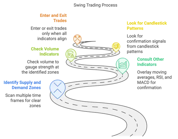
Checklist: Swing Trading Strategy Incorporating Multiple Indicators
Let's say you're a swing trader. You already use moving averages, RSI (Relative Strength Index), and MACD (Moving Average Convergence Divergence) in your trading strategy. Now, you want to integrate supply and demand zones to enhance your decision-making process. Here's how you might go about it:
Conclusion
After years of experience and seeing what works and does not work in the markets, we've found that incorporating supply and demand zones into a trading strategy can be both beneficial and challenging. On the upside, these zones offer high accuracy in predicting entry and exit points, especially when combined with other indicators like candlestick patterns or volume markers. They're also an excellent tool for risk management, allowing traders to set more effective stop losses and take-profit levels. Furthermore, their versatility means they can be used in a variety of market conditions and time frames.
However, it's important to note some limitations. Identifying these zones can be subjective and may require a fair amount of experience and skill. Like any other indicator, they are not infallible and can occasionally give false signals, leading to potential losses.
As for the best markets in which to apply this strategy, we've observed that supply and demand zones tend to be most effective in high liquidity and volume markets. This includes, but is not limited to, stocks, forex, and commodities. So, based on our knowledge, integrating supply and demand zones thoughtfully into your trading strategies might give you an edge, mainly if you're operating in highly liquid markets.
Join Morpher today to access advanced trading tools, seamless charting features, and the powerful insights of Morpher AI for a more informed and efficient trading experience!

Disclaimer: All investments involve risk, and the past performance of a security, industry, sector, market, financial product, trading strategy, or individual’s trading does not guarantee future results or returns. Investors are fully responsible for any investment decisions they make. Such decisions should be based solely on an evaluation of their financial circumstances, investment objectives, risk tolerance, and liquidity needs. This post does not constitute investment advice.

Painless trading for everyone
Hundreds of markets all in one place - Apple, Bitcoin, Gold, Watches, NFTs, Sneakers and so much more.

Painless trading for everyone
Hundreds of markets all in one place - Apple, Bitcoin, Gold, Watches, NFTs, Sneakers and so much more.
