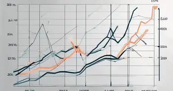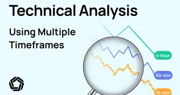


Technical analysis of the financial markets evaluates the past performance of stocks and forecasts future price movements based on historical data. It involves analyzing charts, patterns, and various technical indicators to identify trends and make informed decisions.
The main premise of technical analysis is that price movements and trading volume are not random. Rather, they follow predictable patterns that can be identified and capitalized upon.
One of the key benefits of technical analysis is that it can be used to identify entry and exit points for trades, helping investors to make more informed decisions about when to buy and sell stocks.
Here are a few reasons why technical analysis is important in financial markets:
- Technical analysis helps traders and investors identify trends and cycles in the market, such as uptrends, downtrends, and sideways trends.
- Technical analysis can be used to identify entry and exit points for trades by looking at key levels of support and resistance.
- Technical analysis can be used to confirm or refute the findings of fundamental analysis. If a company has strong earnings and revenue growth, but the stock price is declining, technical analysis may indicate that the stock is oversold and due for a rebound.
Four Core Technical Analysis Concepts to Master
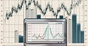
Price and Volume Analysis
Price and volume analysis is a technique used to evaluate the price movements and trading volume of a security over time.
Price analysis involves studying the historical price movements of a security to identify trends and patterns. Some of the key price indicators used in price analysis include:
- Resistance and support are levels on a chart where the price of a security has historically shown a tendency to bounce off. These levels can be used to set buy and sell orders.
- Moving averages are common price indicators that help traders smooth out price fluctuations and identify trends. Two common types of moving averages are the Simple Moving Average (SMA) and the Exponential Moving Average (EMA).
- Candlestick charts help visualize price movements over a specific period of time. Each candlestick represents a trading day, with the body of the candlestick representing the opening and closing prices and the wicks representing the highs and lows of the day.
Volume analysis involves studying the trading volume to identify trends and candlestick patterns. Some of the key volume indicators are summarized below.
- On-Balance Volume (OBV) is a volume indicator that tracks the total volume of a security over time.
- Volume oscillators help traders identify changes in volume over time. Two common volume oscillators are the Chaikin Oscillator and the Volume Rate of Change (VROC).
- Volume patterns can be used to identify potential trend reversals or continuations. For example, if security is trending upward and volume is increasing, this may indicate that the trend is likely to continue.
Price and volume analysis can provide valuable insights into market trends and price movements. By studying historical price and volume data, traders can identify potential entry and exit points and set stop-loss orders to minimize losses. Additionally, price and volume analysis help traders confirm or refute the findings of other forms of analysis, such as fundamental analysis.
Trend Analysis
Trend analysis is a technique used to identify trends and patterns in price movements over time. By studying these trends, traders and investors gain insights into market sentiment and make informed decisions about buying and selling securities.
Key elements of trend analysis are summarized below.
- Trend lines identify the direction and strength of a trend. An uptrend may be visualized by a number of highs that are higher and lows that are higher. Similarly, a downtrend may be visualized by a number of highs that are lower and lows that are lower. Trend lines can be drawn by connecting the highs and lows on a chart.
- Moving averages are indicators that smooth out price fluctuations and identify trends. The Simple Moving Average (SMA) and the Exponential Moving Average (EMA) are commonly used moving averages. For example, a five-month Simple Moving Average of Bitcoin (noted in blue) is illustrated in the chart below. Note how this moving average smooths out price fluctuations.
Bitcoin Simple Moving Average (source: Morpher.com)
- Price channels are created by drawing parallel lines above and below a trend line. The top line represents resistance, while the bottom line represents support. Traders can use price channels to set buy and sell orders.
- Technical indicators can be used in conjunction with trend analysis to confirm or refute trends. For example, the Relative Strength Index (RSI) is used to identify overbought and oversold conditions. RSI charts are mapped on a scale ranging from 0 to 100. An RSI value greater than 70 tends to indicate that the stock is overbought. An RSI value of less than 30 indicates an oversold condition.
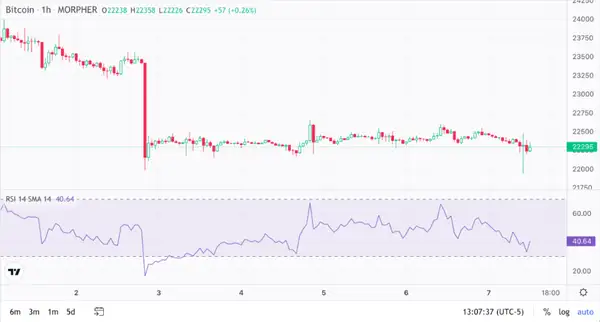
Illustrated above is a five-day day RSI chart for Bitcoin. Note a sharp drop in Bitcoin’s RSI coinciding with the sharp drop in price, leading to an oversold condition.
Market Cycles
Market cycles refer to the regular pattern of ups and downs in the stock market. These cycles are driven by a combination of economic, political, and social factors that influence investor sentiment and behavior.
Here is a summary of the four key phases of a typical market cycle.
- The accumulation phase is characterized by a period of economic growth, low employment, and rising corporate profits. Investor confidence is high, and stock prices tend to rise.
- The markup phase is a period of high investor confidence and rising stock prices. Economic growth begins to slow, and corporate profits may start to level off.
- The distribution phase is characterized by a period of economic slowdown, rising unemployment, and falling corporate profits. Investor confidence wanes, and stock prices tend to fall.
- The trough phase is a period of economic decline, high unemployment, and low corporate profits. Investor confidence is at its lowest, and stock prices tend to bottom out.
Understanding market cycles can provide traders and investors with valuable insights into market trends and price movements. By identifying which phase of the market cycle the market is in, traders can adjust their investment strategies accordingly.
For example, during the accumulation phase, traders may focus on buying stocks that are expected to perform well in a growing economy. During the distribution phase, traders may focus on defensive stocks or short-selling opportunities.
Support and Resistance Levels
Support and resistance levels are key concepts that traders use to identify potential buying and selling opportunities.
Support levels refer to price points where a security's price is likely to stop falling and potentially reverse course. Support levels are often created when there is a large number of buyers in the market, creating a demand for security at a particular price.
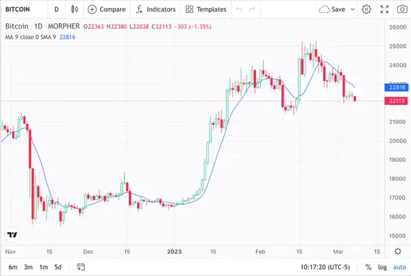
For example, a support level of $16,000 for Bitcoin is designated in blue in the chart reproduced below. At this support level, the price of Bitcoin has repeatedly stopped falling lower, only to bounce back with forward momentum.
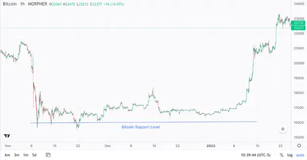
Bitcoin Support Level (source: Morpher.com)
If a security's price repeatedly falls to a support level and then bounces back up, traders may interpret this as a buy signal. And this is exactly what happened when Bitcoin experienced a bit of a bull market around January 15th.
Resistance levels refer to price points where a security's price is likely to stop rising and potentially reverse course. Resistance levels are often created when there is a large number of sellers in the market, creating a supply of the asset at a particular price.
For example, a resistance level of $24,000 for Bitcoin is designated in blue below. As can be seen from this chart, this resistance level is where the price of Bitcoin has repeatedly stopped rising, only to reverse course.
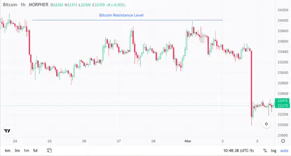
If a security's price rises to a resistance level and then fails to break through, traders may interpret this as a sell signal. And this is exactly what happened to Bitcoin as it experienced a bit of a bear market run around March 3.
Technical Analysis Tools and Techniques
Candlestick Patterns
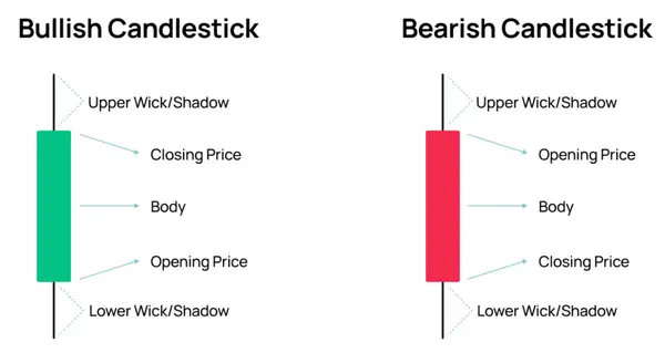
Candlestick patterns are formed by the arrangement of individual candlesticks on a chart. They display the open, high, low, and closing prices for a given security over a specified period of time, typically ranging from one minute to one month.
Traders use candlestick patterns to time entries and exit trades. These patterns can provide valuable information about the market sentiment, as well as the potential direction of price movement. For example, a bullish candlestick pattern may indicate that buyers are in control, while a bearish candlestick pattern may indicate that sellers are dominating the market.
The Anatomy of a Candlestick (source: Morpher.com)
The candlestick body is equivalent to the difference between the opening price and the closing price. The body is the solid part of the candlestick that is shaded or colored to represent the opening and closing prices.
The wick, also known as the shadow, is the thin vertical line that extends from the top and bottom of the body. It represents the high and low prices during the same period.
The length and thickness of the body provide information about the price movement of the asset. A long body denotes a strong price movement, while a short body denotes a weak price movement.
The color of the body can also provide information about the price movement. Typically, a green body denotes bullish movement, while a red body denotes bearish movement.
Fibonacci Retracements
Fibonacci retracements are used to identify potential levels of support and resistance.
The Fibonacci sequence is a series of numbers where each number is the sum of the two preceding numbers: 0, 1, 1, 2, 3, 5, 8, 13, 21, and so on. Traders use these numbers, or ratios derived from them, to identify potential levels of support and resistance.
To use Fibonacci retracements, traders first identify a significant price move, such as a sharp rise or a sharp fall. They then draw a horizontal line at the highest point of the move (100%) and another line at the lowest point of the move (0%).
Traders then draw additional horizontal lines at various ratios derived from the Fibonacci sequence, typically at 23.6%, 38.2%, 50%, and 61.8% retracements. These lines represent potential levels of support and resistance.
An example chart illustrating various Fibonacci retracement levels is reproduced below.
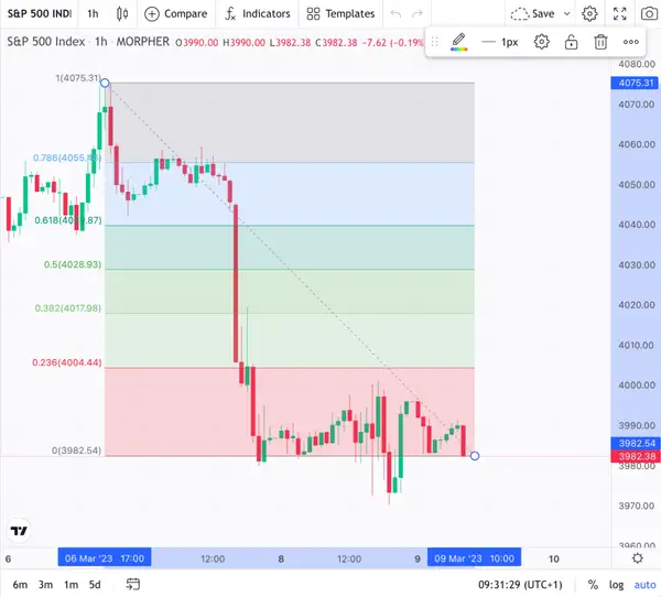
Fibonacci Retracement Levels (source: Morpher)
If the security's price retraces to one of these levels, traders may interpret this as a potential buying or selling opportunity. For example, in the example illustrated above,
the security's price retraced to the 38.2% retracement level and failed to break through. Traders may interpret this as a sell signal, as it suggests that the security's price is likely to continue falling. And indeed, this is what happened in the example illustrated above.
Elliott Wave Theory
The Elliott Wave Theory is based on the idea that market trends are cyclical and can be broken down into smaller patterns that can be used to predict future price movements.
According to the Elliott Wave Theory, market trends move in Motive Waves comprising a series of five smaller waves as illustrated below.
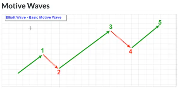
Elliot Motive Waves (source: stockcharts.com)
The impulse waves are numbered 1 to 5, with waves 1, 3, and 5 moving in the direction of the trend. Waves 2 and 4, called corrective waves, move against the trend.
Traders use the Elliott Wave Theory to identify potential turning points in the market and to determine when to enter or exit trades. They do this by analyzing the size and duration of each wave, as well as the relationship between the waves.
The theory is also based on the idea that the size and duration of each wave are related to the overall size and duration of the trend. For example, if wave 3 is the longest and most powerful wave in an uptrend, it is likely that the subsequent corrective wave, wave 4, will be relatively short and shallow.
Traders also use the Elliott Wave Theory to identify potential levels of support and resistance based on the relationship between the waves. For example, if wave 2 retraces 50% of wave 1, it is possible that wave 4 will also retrace 50% of wave 3.
Guppy Multiple Moving Average (GMMA)
Guppy Multiple Moving Average (GMMA) is a tool designed to identify the direction and strength of a trend and to identify potential support and resistance levels.
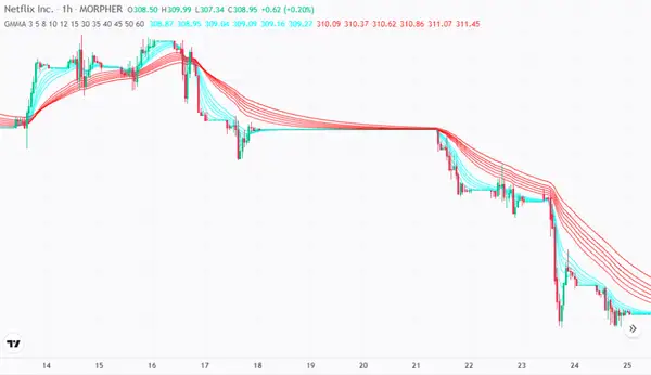
The GMMA consists of two groups of moving averages, known as the short-term and long-term moving averages. The short-term group consists of 3, 5, 8, 10, 12, and 15-day moving averages, while the long-term group consists of 30, 35, 40, 45, 50, and 60-day moving averages.
The short-term moving averages are designed to capture the short-term momentum in the market, while the long-term moving averages are designed to capture the long-term trend. When the short-term moving averages reside above the long-term moving averages, it indicates a strong uptrend. When the short-term moving averages reside below the long-term moving averages, it indicates a strong downtrend.
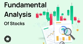
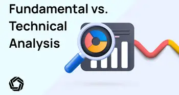
Technical vs. Fundamental Analysis
The debate between technical analysis vs. fundamental analysis is one of the most controversial topics in the world of finance. Both approaches are used to analyze financial markets, but they differ in their methodologies and the types of information they use to make investment decisions.
Fundamental analysis is based on the idea that a company’s intrinsic value can be determined by analyzing its financial and economic data, such as its earnings, revenue, assets, liabilities, and management. Fundamental analysts believe that the market may not always be efficient and that there may be opportunities to profit from stocks that are undervalued and overvalued based on their intrinsic value.
On the other hand, technical analysis is based on the idea that market trends, patterns, and behaviors can be analyzed to predict future price movements. Technical analysts believe that all relevant information is already reflected in the price of a security and that past price and volume data can be used to identify potential levels of support and resistance and to make investment decisions.
Advantages and Limitations of Technical Analysis
Like any investment approach, technical analysis has its advantages and limitations.
Advantages of Technical Analysis:
- It is based on objective data, such as price and volume data, rather than subjective factors, such as management quality or company financials.
- It can be applied to any market, whether it is stocks, bonds, or cryptocurrencies.
- It can identify market patterns and trends, such as uptrends and downtrends.
- It can help manage risk by identifying potential levels of support and resistance, thereby helping set stop-loss orders.
Limitations of Technical Analysis:
- It is based on past price and volume data, and as such, it is not a reliable predictor of future price movements.
- It does not take into account other important factors, such as management quality or company financials, that can affect the performance of a security.
- Technical analysts often use a wide range of indicators to analyze the market, which can lead to information overload and confusion.
- It relies on subjective interpretation of past price and volume data, which can lead to different conclusions.
Conclusion
Technical analysis is an important approach to understanding financial markets and includes key concepts like trend analysis, support, resistance levels, and price action analysis. Technical analysts use a range of tools and techniques, including candlestick patterns, Fibonacci retracements, and Elliott Wave Theory, to analyze market data and make informed trading decisions.
While technical analysis is a powerful approach, combining it with fundamental analysis is important to get a complete picture of the market. Fundamental analysis involves looking at macroeconomic and industry-specific factors that can affect asset prices, such as interest rates, company earnings, and geopolitical events.

Disclaimer: All investments involve risk, and the past performance of a security, industry, sector, market, financial product, trading strategy, or individual’s trading does not guarantee future results or returns. Investors are fully responsible for any investment decisions they make. Such decisions should be based solely on an evaluation of their financial circumstances, investment objectives, risk tolerance, and liquidity needs. This post does not constitute investment advice.

Painless trading for everyone
Hundreds of markets all in one place - Apple, Bitcoin, Gold, Watches, NFTs, Sneakers and so much more.
Painless trading for everyone
Hundreds of markets all in one place - Apple, Bitcoin, Gold, Watches, NFTs, Sneakers and so much more.